If you’re trying to attract more customers to your store, in-store signage can be one of the most cost-effective ways to do so. But with the myriad options available, it can also be confusing to know where to start when it comes to improving your in-store signage. To help you get started with choosing the right signage for your store, here are 3 ways to upgrade your in-store signage.
Table of Contents
What Is Retail Store Signage?
These days, it’s more important than ever for retail stores to be as competitive as possible. To do that, many businesses invest in retail store signage, which is an effective way of creating a stronger brand image and boosting consumer engagement. Retail store signage offers one of your best opportunities for adding visual appeal without breaking your budget. When done right, retail store signage can also make customers think your business is larger and more established than it actually is.
Introduction To Retail Store Signs:
The first thing people see when they walk into your store is your signage. A sign that accurately represents your brand and catches people’s attention will make them more likely to shop at your location instead of somewhere else. In retail, displays often mean sales, which means you should make sure yours are as professional as possible.
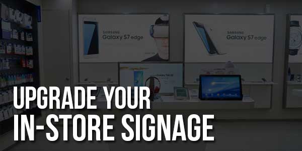
For example, if it’s an electronics store that wants to incorporate cutting-edge technology into its displays, duratrans transparencies can be used to showcase products with high-definition images printed directly onto their surface. When placed behind a window or against a wall, these transparencies create eye-catching graphics that not only advertise your products but also serve as a form of branding for yourself as a company.
While you might think you know everything there is to know about signage and what works best for your business, there are actually many subtle nuances and subtleties that go into creating an effective display. Here are some tips on how to create one:
- Choose a theme: The first step in creating an effective retail sign is choosing a theme or idea that will run throughout all your marketing efforts and materials. It doesn’t have to be complicated—it could be as simple as finding one keyword that encompasses what you do.
- Plan out your placement: You should not only know where you want each piece of signage in your store, but also which direction it should face, how far from a window it should be, and how much exposure you’d like it to receive from customers passing by outside.
- Choose high-quality materials: A cheap material might save you money in printing costs now, but will probably result in decreased value down the road when they start to fade or peel. Choosing materials that are high quality can make all of these signs more appealing in both appearance and durability over time.

Types Of Signs:
All businesses need signage. But it’s not as simple as slapping a few stickers on a window and calling it a day. A quality sign should be easy for customers to read from outside your store, but visible enough that they don’t feel like they need binoculars to figure out what you do inside. A good starting point is making sure you have at least one marquee, which is best for brand recognition, while some other types of signs are better suited for advertising your specials or letting customers know what products you sell. The type of sign you choose will vary depending on what you want your business identity to look like.
3 Ways To Upgrade Your In-Store Signage:
So how do you upgrade your in-store signage? Let’s look at three ways you can invest in upgrades that will create more memorable experiences for customers:
1) Become your customer with empathy exercises Not all customers are created equal—they have different pain points, needs wants, etc. Empathy exercises help retailers acknowledge that every customer is unique. Retailers can make upgrades by creating more targeted campaigns for these segments of customers.
2) Improve traffic flow If your store’s interior isn’t clean and easy to navigate, it could be scaring off potential new customers. Customers don’t want to waste time figuring out where they need to go in order to buy what they came for; they need an optimal experience from beginning to end. Better signage inside of stores helps with navigation, making your store both easier and faster for visitors.
3) Use more visuals This seems obvious—but there’s a reason why we had to list it: upgrading in-store signage is as simple as that! Research has shown that using visual content can increase conversion rates by up to 80%.
Conclusion:
Retail store signage is a major factor in sales. The right graphic can catch a customer’s eye and inspire him or her to make a purchase. However, not all graphics are created equal. Make sure your signs clearly convey your message! When it comes to your in-store signs, you want them to stand out. If you want to attract people and keep them coming back for more, make sure your store is able to communicate with customers clearly and effectively.

 About the Author:


Yes i am totally agreed with this article and i just want say that this article is very nice and very informative article.I will make sure to be reading your blog more.
Welcome here and thanks for reading our article and sharing your view. This will be very helpful to us to let us motivate to provide you with more awesome and valuable content from a different mind. Thanks again.