
Choosing an appropriate navigation system for your website design is as important as other main features of a website. It gives your website a professional look and helps your visitors getting on their desired page rather than messing around that increases the rate of your returning visitors. To achieve a highly user interface design you have to choose a right navigation system which is well curated.
Top Horizontal Bar, Vertical Sidebar, Fly-Out, Drop-Down, Footer are widely used navigation systems:
Table of Contents
1.) Top Horizontal Bar Navigation:
Top horizontal bar navigation is widely used system and is commonly located horizontally above or below the site header and adjacent to the site’s logo in all web pages of a website. Navigation menus can simply be text links, button-shaped, or tabbed-shaped.
Applications:
- It is a right choice for simple sites that need to be kept clean. Check below image:

- In order to get more links, this system can be incorporated with drop down menus. Check below image:

Limitation:
As mentioned above that this type of navigation is best suited for simple sites, that means it is not the right choice for websites having too many navigation tabs as shown in the image below:
This type of navigation system is practically useful for online tutoring, stationary store, and other business having limited services or products who want to look their website clean.
2.) Vertical Sidebar Navigation:
When menu tabs are placed in an order as one on top of another the navigation system is vertical sidebar navigation. It’s most commonly located on top left corner of the page. Vertical navigation system is often placed on right side of the page however it is least preferred. Vertical menus can simply be text links for navigation items (with and without icons) and tabs are rarely used. See the image below:
Applications:
- The vertical sidebar navigation design pattern is preferred over horizontal navigation system when there is more number of menu tabs or links.
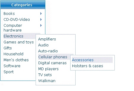
- It is advisable to avoid a bulk of links and rather go with fly-out sub-navigation menus or divides your links into sub categories so that user may find desired link easily. Check below image that how a designer subcategorized the menu tabs and used fly-out menu in order to give a site a professional and clean look.
Limitation:
- Sometimes vertical navigation system becomes overwhelming for your website visitors as it carries a lengthy list of links.

This system is well suited for business like fast food restaurants, fashion houses and other holding sub categories in their products or services. But make sure the number of links should be limited because too many links can make your website heavy.
3.) Drop-Down Menu Navigation:
Drop-down menus run top to bottom when main tab is clicked or hovered by mouse. These are commonly used with top horizontal bar navigation and not only give your busy website a sophisticated look but also help your site visitors finding their desired category easily. Those businesses having wide range of products and services like Kitchen appliances or electronics, this type of website helps them to place all their products in a concise way without making look their website cluttered. In order to let your visitors know about more sub categories associated to the main tab you can put an indication like an arrow with your main tab. Check how a designer put an indication with the main tab: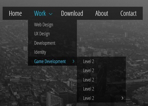
Applications:
- This system is commonly used with top horizontal bar navigation system.
- This gives your busy website an uncluttered look.
- It holds more navigation tabs than what horizontal navigation system can hold alone.
- It also helps your site visitors finding their desired category easily.
Limitation:
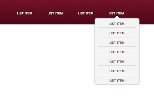
- Your visitors sometimes may not realize that it’s a drop down menu until they hover pointer to the tab. Check below image where there is no indication for drop down menu tabs:
4.) Fly-Out Menu Navigation:
Fly-out menus run left to right when main tab is clicked or hovered by mouse and are used with vertical bar/sidebar navigation. Do not forget to put an indication with the main tab, in order to let your website visitors know of the associated fly-out menu. See below image: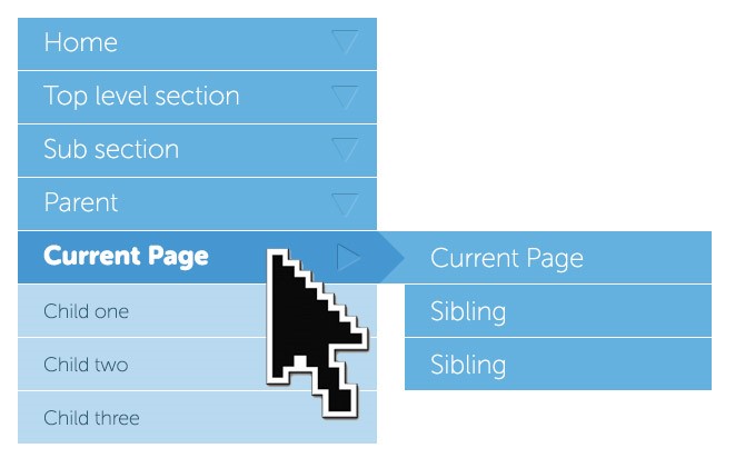
Applications:
- Like Drop down menu, this system also gives your site an uncluttered look.
- It helps your site visitors reaching their desired page.
- There are 2 types of fly-out menus:
- Fly-out Expanding: When you want to keep list of your tabs short.
- Tree-like Expanding: When you want your navigation tabs organized nicely with clean and professional look.
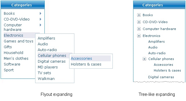
Limitation:
- Just like fly out menu system, there is a problem with drop down menu system that your visitors may not notice the subcategories associated with the main tabs.
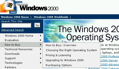
This type of navigation system is very effective if you want your visitors to reach you items quickly. Microsoft is the best example of business that use fly out navigation extensively. See the image below:
5.) Footer Navigation:
Footer navigation is used when main navigation system is not enough to fit all the links to the site and/or when your web page is too lengthy that visitor does not like to scroll up to go to the main header tabs. It may contain sitemap. This type of navigation system often uses text links.
Application:
- The best purpose of footer navigation is to repeat the main header or used for secondary navigation.
Limitation:
- The problem with this system is that it cannot be used as a primary navigation system for the websites with long pages as no one is willing to scroll down just to have a look at your navigation tabs.
Footer navigation can be used to catch visitor’s attention by making footer inspiring and perfectly colorful.
Conclusion:
Having a navigation tab for website is important but choosing the right type of navigation is more important, as if one navigation system is best for a website it may become the worst choice for another site. So, before going with any of the navigation systems, first understand your website design and choose a system that will fit well with your site. Remember, more than one navigation system can also go well with your website design. For instance, a shopping cart website may contain horizontal navigation system as it requires clean and uncluttered presentation of all the main tabs and also a vertical navigation system so as to organize a large product tabs list nicely.
Or for instance, if your website contains too many tabs, so in order to achieve clutter free look of your website you will choose horizontal menu (for cleaner look) along with the drop down menu navigation system (for multiple tabs). So, understand the type and requirement of your site first and choose all those navigation system that can satisfy your site’s requirements and allows your visitors to quickly reach on the tab or item they are looking for.

 About the Author:Fiona Allen is a designer and writer. She has been working for 5stardesigners for over 2 years and trained many designers who wishes to built their career in article writing too. 5stardesigners aims to provide Custom Logo Design Service to both small and medium size businesses all over the world. Follow @5stardesigners on Twitter to know more about company.


i have implemented all these navigation systems in my website and it is very beneficial for the users.my favorite is fly-out menu navigation i use to implement it in all my website. one thing i like about your post is the limitation you have provided here that will help us to improve our website.
thanks for sharing!!
Welcome here and thanks for reading our article and sharing your views..
I like these kinds of articles because these kinds grow my skills on designing . i suggest you make article about some jQuery tricks
Welcome here and thanks for reading our article and sharing your views.