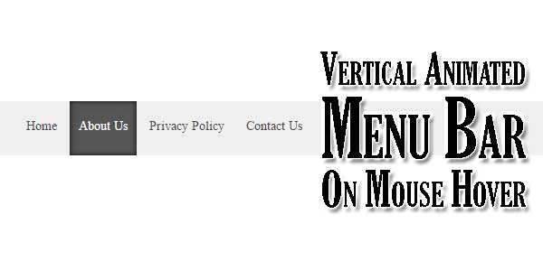
Menu bar is a important piece of your web or blog because its a base of your SEO too as it helps user to go to the direct on there desired page that every user want to do with easiness. So you need it then why not to use awesome design that will attract more visitors and also will have less weight so add it after things all things.
Every website need several attentions that could only get by an amazing menu bar that could catch your prospective customers eyes as well as let them to stay there that could increase the benefits additionally. There are various menu bar on internet even so the size are generally to high that could effect the loading time period so think hard before with them.
Table of Contents
Features:
1.) Pure HTML-CSS Added.
2.) No External JavaScript Or JQuery File.
3.) CSS3 Added.
4.) Simple And Fast Loading Code.
5.) Can Work With Any Browser.
How To Add In A WebPage?
1.) Just Go To Your “Web Page File”.
2.) Now “Copy” The Below Codes And “Paste” It To There Positions.
3.) “Save” It, Now You Are Done.
CSS:
<style>
nav#bar1 {height:60px; margin:0 auto; background:#efefef; font-size:14px; overflow-y: hidden;}
nav#bar1 ul {margin:0 auto;height:60px;}
nav#bar1 li {list-style-type:none; display:inline-block; text-align:center; height:40px; padding:0 10px 20px 10px;}
nav#bar1 li a {height:60px; text-decoration:none;}
nav#bar1 li .before_hover {position:relative; top:20px; transition: all 0.5s ease;}
nav#bar1 li .after_hover {position:relative; top:90px; left:0px; color:#fff; transition: all 0.5s ease;}
nav#bar1 li:hover .before_hover {top:-90px;}
nav#bar1 li:hover .after_hover {top:0px;}
nav#bar1 {float:left;}
nav#bar1 ul {width:760px;}
nav#bar1 ul li a {color:#444;}
nav#bar1 li:hover {color:#fff; background:#555; -webkit-box-shadow:0 0 7px rgba(0,0,0,0.9)inset; -moz-box-shadow:0 0 7px rgba(0,0,0,0.9)inset; box-shadow:0 0 7px rgba(0,0,0,0.9) inset;}
</style>
HTML:
<nav id='bar1'>
<ul>
<li><a href=''>
<span class='before_hover'>Home</span><br/><span class='after_hover'>Home</span>
</a></li>
<li><a href=''>
<span class='before_hover'>About Us</span><br/><span class='after_hover'>About Us</span>
</a></li>
<li><a href=''>
<span class='before_hover'>Privacy Policy</span><br/><span class='after_hover'>Privacy Policy</span>
</a></li>
<li><a href=''>
<span class='before_hover'>Contact Us</span><br/><span class='after_hover'>Contact Us</span>
</a></li>
</ul>
</nav>
Customization:
1.) Edit Your HTML & CSS As Per Your Requirements. Rest Is Ok For General Us. If You Are Pro, Then You Can Do Any Thing.
Last Words:
That’s all we have. If you have any problem with this code in your blogger template then feel free to contact us with full explanation of your problem. We will reply you as time allow to us. Don’t forget to share this with your friends so they can also take benefit from it and leave your precious feedback in our comment form below. Happy blogging, See you in next article…


great recommendations on improving the menu, thanks for the detailed information
Welcome here and thanks for liking our code.
Thanks for this post, I will use this code in my upcoming project.
Welcome here and thanks for liking our code.
@Admin
Each site require a few considerations that could just get by an astounding menu bar that could get your forthcoming clients eyes and additionally let them to stay there that could build the advantages moreover. There are different menu bar on web even so the size are for the most part to high that could impact the stacking time period so consider every option before with them.
regards
rakhi
Welcome here and thanks for liking our article and sharing your views. Stay with us to get more like this.
great post thanks for share this useful and informative post
nice job
Welcome here and thanks for liking our article and sharing your views. Stay with us to get more like this.
i like it and keep it up.good job
thanks
Welcome here and thanks for liking our code…
Such a nice and knowledgeable article. Thanks for sharing such kind information with us.
Welcome here and thanks for liking our article…
Awesome. But its look very odd, when text goes right up on mouse move.
Please make text coming center in the box on mouse move event. Thanks
Welcome here and thanks for reading our article and sharing your views. Thats DEMO problem. You can get codes from us via email directly…