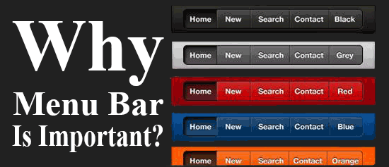
Hyperlink has been the most vital part of navigation since the inception of the Internet. The web would have no purpose to solve if different web pages weren’t being connected with each other through hyperlinks. So I guess this is the reason why you need to put a lot of effort and time to design navigation & links.
Table of Contents
Changing Scenario Of Website Navigation:
The best thing about website design is unlimited number of options available to the users. Yet navigation is still about existing bar options. Small websites on one hand prefer a horizontal bar at the top, while on the other hand large websites prefer a vertical navigation bar to include a number of pages & links. In some other cases fly-out or drop down menus are used to have a compact navigation.
We have used these solutions since ages & hence we are now used to the initial web design limits. As time went by, users became more status conscious. Now they look for more creative, engaging & user friendly navigational solutions. But still questions remain: Are conventional navigation alternatives still the ideal ones?
Inspiration From Worldly Things:
You must be wondering from where the inspiration of site navigation comes. It comes from things present in your vicinity & your environment. Our car dashboards, remote controls, stereo systems, keyboards, vehicles, appliances, computers, and much more, have a variety of colors, sizes & shapes with a firm objective in mind.
Have you ever wondered why the space-bar key on a keyboard is the largest? It is not because it is the most important key, but the real reason is that it is the most used key on a keyboard. We have got the ability to design solutions without compromising on accessibility or flexibility. A circle is more convenient compared to other shapes because it saves a lot of space, but the beauty lies in taking all the consideration & time to scan all the constraints to bring out individual personalized solutions.
Ways To Design Perfect Navigation For A Website:
A few pixels go in setting up good navigation. But what arguably is the most essential part is the aspect present in your website. Also, what things to include as a part of the main navigation is a hot topic to discuss. This could really make a big difference when it comes to bounce rate & conversion. There are a lot of things to consider when making decisions related to navigation.
A Few Things To Include:▼
The navigation should be limited to not more than 7 items if you want to achieve an effective user experience & SEO. So how to shortlist the important items? The best thing to do is to take opinions from the stakeholders who will be the ultimate visitors to your website.
1.) Card Sorting:
The advantage of using this method is that you need not require any user experience based prototype or model. Invite external people for an exercise of around 20 to 25 minutes. Lay a stack of cards on the table with each acting as a page of your site. Just have a close look at how people organize them, systematically arrange them & then name each one of them. The resulting output could be the backbone of your site navigation.
2.) Conversion Report:
With the help of software for marketing analytics, you can opt for a report which will assist you in the conversions & what actually goes with the main navigation. It also tells the most common pages that are being viewed as well as which end up bringing in the customers.
3.) User Flow:
In case of the absence of a report that assists in conversions, there is a Visitor’s Flow report which tells the important pages on your site. It does not separate prospective customers from the standard traffic but it certainly does highlight the navigational experience of the people on your site. In short it is Google Analytics Report that represents the individual paths of the users visiting your site in a graphical manner.
Ordering Of The Navigational Components:
An order does matter when it comes to navigating on a website. The links on either page of a website tend to be remembered more efficiently than when present anywhere else. Words present first or last as far as the list is concerned tend to attract more people. So you need to think typically from a viewer’s point of view as to what items to place where.
Phrasing Of The Navigational Elements:▼
How is the phrasing of the navigational options done as per your business? It could really vary from the most easy & straightforward to highly unique & innovative ones. While choosing the phrases for the navigational links think how your customers will go about & also keeps in mind the SEO angle.
1.) Object Phrasing:
The most crystal clear option among all is object based phrasing. The navigation in this case places the content in specific groups. In such a set-up, navigation is treated as a content table wherein pages under the same topic groups are placed together. Such a phrasing helps in smooth search functionality.
2.) Action Phrasing:
Transactions based websites are best served through action based phrasing. Herein you can ask your visitors to visit your website, know exactly what’s in store & finally let them take an action.
3.) Audience Phrasing:
Organizations with different categories of audiences will really opt for this kind wherein you can have sub-navigation or navigation audience based phrasing. This is a type which only works when the audience can classify themselves.
4.) SEO Phrasing:
The phrasing which is just audience dependable is simply not enough. More importantly the navigation terms should be optimized enough from the search engines results perspective. With the help of Google Keywords Planner & Analytics tool, you can find out the most popular keywords that bring maximum users on a website. You can use the different variations of those words for navigation on your website.
Final Benchmarks To Look For:
Rather than referring to benchmarks set by the industry, go for your own ones. Analyze the navigational CTR once every month & see how the varying choices have affected the Click Through Rate. Couple all that data to the conversion data & sub pages to get a more complete picture.
Ground your decisions with the help of customer interviews & data while dealing with the choices in navigation. Prioritize the word choices, order, items that make the maximum sense for the website users in tracking the decisions that you have made in order to test different scenarios of a marketing funnel.
 About the Author:
Alan Smith is an avid tech blogger with vast experience in various IT domains, currently associated with SPINX Inc., a Los Angeles based Web Design and development company.


Be the first to write a comment.