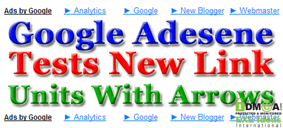
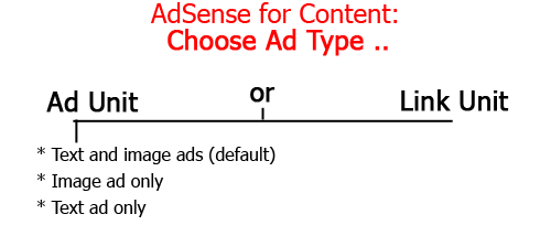
In 2006, Google advertisements were released in multiple languages. By selecting the primary language on your website, the ads will run in that language for the most part, but will also be shown in different tongues to gain more clicks. In 2011, Google Adsense tried changing the background colors when the mouse hovers the link units. While doing so, the link or URL to the ad is revealed. Also in the same year, Google enlarged the text of the first ads to get more exposure and thereby additional clicks.
Not too long ago, they released 2×2 Adsense units found normally below blog titles. These banner ads have proven very effective in getting more clicks. This year, Google tests new Adsense link units with arrows.
Table of Contents
Some Facts About Adsense:
For those of you who do not know, Google Adsense is a program offered by Google, Inc. which allows users to link their advertisements to multiple websites thereby generating traffic and income. The increasing value of search optimization techniques requires web developers to increase quality web contents — articles, images, videos, pod/blogcasts, etc — to attract more Adsense advertisements. Web contents can suggest the ads within the site by highlighting them with Sponsored Links or Advertisements. Adsense link units also stayed empowered by Google.
When customers click on the ad links, they are directed to a set of contextual ads, which earns money for Adsense patrons. Some advertisers are allowed to choose the ads that will run through the websites whether it has anything to do with the business at all or not. Interest-based advertising allows the web owners to reach customers based on their behavior or the common websites they visit. The analytics traces the inbound and outbound links and thereby suggests based on the results as to what ads would be most enticing.
Ad Preferences Manager allows the web developers to choose the areas of interests from a list of categories so there would be a focused ad campaign running through the site and not just random ads pooled by Adsense. This way, the ads are easily monetized and the visitors are left with a more relevant experience. These links are commonly placed eye level on a website or near titles of main frames within the web page.
What Is CTR?
The success of each ad is measured via CTR of Click Through Rate. This is the percentage of clicks against the actual number of visits to the website. For instance, your ad has been seen 100 times and your ads were clicked 20 times, then your CTR is 20%.
Knowing the CTR is significant in measuring the effectiveness of the ad copy. If the ad has been clicked more times than others then there must be something about that ad that was effective in luring customers to take a look.
The Arrows:
The arrows appear to work as it actually brings the eye-focus directly to the ad. The simple shapes draw the attention towards the ad thereby giving more chances that the ad will be clicked and generate more money because it gives the ad a higher CTR. As one clicks on the ad, the web user is then directed to some contextual adds which when clicked will generate an income for the Adsense publisher.
However, in designing your website, keep in mind that the shapes should not distort the original Adsense arrow so as not to confuse customers with the ads and the contents. While most Adsense link units are found on the bottom part of web pages, some fit well on the same spots as regular Adsense as long as the design does not clash with the arrows.
Google Adsense does not stop testing a variety of ways to catch attention on their link units and the new design with the arrow highlights a more effective way of drawing attention for web users to click on the Google Ads.
 About the Author:
Iryna Ostapets is a tech writer and blogger laying out for tech news via online exposures. She is the author of the site: iPhone spy where you can get valuable information about spy software program on your cell phone.


Interesting news . It would be great if you can provide more details about it. Thanks you
You Are Welcome Here, Be-With Us To Get More…